
Marketing dashboards that make sense: How to create a digital analytics dashboard to track results
Most teams have the data. The challenge is turning it into actionable marketing insights.
Tracking marketing performance is critical, but without a clear marketing dashboard, it can be overwhelming to mine the various point of data you have. Data lives across platforms, and pulling results together can take hours, often missing the insights that actually improve strategy.
What’s needed is alignment. Start with what matters most across your customer journey, then build those goals into a custom digital analytics dashboard. It doesn’t have to be complex or expensive. The right dashboarding tools let you combine data from your website, marketing channels, and internal systems to give you a clearer picture of what’s working and where customers get stuck.
Consider end-of-month or end-of-campaign reporting:
You log into Google Analytics 4 (GA4) and start clicking around. A colleague asks for a specific metric, but you can’t find it. A quick Google tells you that you’ll need to build a custom report, but you’re already out of time.
Next you jump into Google Ads or Meta. The numbers look strong — impressions, clicks — but are they actually converting? Then someone asks the one question you dread: what happens once they land on the website?
And that’s just the start. You still need to check your email results, then figure out if any of your conversions — sales, donations, signups — can be tied back to campaign activity.
With more data than ever, it’s still hard to answer a simple question: what actually worked?
That’s where a custom dashboard makes all the difference. It brings together the numbers that matter most in one clear view. No jumping between tools. No guesswork. Just actionable insight tied to your goals.
Let’s break down how it works.
What to expect from a good custom marketing dashboard
A good dashboard isn’t just a bunch of graphs. It gives your team clarity. It brings together results from the tools you already use, so you can see what’s working and what needs attention. Whether it's a channel lead tracking campaign performance or a senior exec needing a quick overview, a useful dashboard makes it easy to stay focused on the numbers that matter.
But before you build anything, you need alignment across teams on what really matters to report, and where along the customer journey those key metrics sit. That starts with a clear measurement strategy.
Step 1: Build a marketing measurement plan aligned to your goals
Before you open GA4 or any other analytics tool, you need to know what you’re measuring and why. That means building a simple measurement plan that outlines your key objectives, mapped to your customer journey. Ideally: how do your business objectives match down to the key marketing objectives, and what metrics give clarity for these?
Think of this plan as your blueprint that will clarify what is important to measure, show performance and share with your business . It should capture both your high-level business goals — like increasing leads, driving sales or lowering acquisition costs — and the performance metrics that show progress at each stage of the journey. This is how you identify where customers are getting stuck, and where your campaigns are underperforming.
You’ll also want to consider how you report:
A month-by-month view for execs
A cross-channel journey view for the marketing team
Campaign snapshots for wrap-up reporting
Specific channel views to optimise performance
Once you know what you need to see, you might wireframe your ideal dashboard, like you would a website, with input from your team, and anyone else who relies on this data. For some, that might mean just one dashboard. For others, it might mean three or four connected views that each serve a specific purpose.
Step 2: Get your data in order
Even the most advanced dashboard is only as good as the data behind it.
That means getting the basics right, from UTM tagging, to setting custom events in Google Tag Manager, and ensuring you have goals setup in GA4.
We also recommend syncing key metrics from your CRM, email automation tool or other internal customer data systems to complete the picture.
For more advanced thinking: Want to avoid last-click bias? Set up multi-touch attribution.
A more advanced step is to consider mapping your customer segments against data points, to allow you to filter reports by customer segments to know who is converting most.
Step 3: Choose the best marketing dashboard software for your team
There’s no single “best” dashboard, only the best fit for your goals, data, and team.
We help you choose based on your reporting needs, team size, and tech stack. If choosing yourself - don’t get sold on features, ensure you know what measures, views and data you need to see - can the tool deliver that?
Want something lightweight and free? Google’s Looker Studio is basically a one-click setup and as a first step can very simply visuals GA4 and Google Ads results. However, LookerStudio does require a level of manual work higher than some of the less technical tools.
If you prefer cleaner visuals or automated reports? Platforms like Databox or DashThis offer more polish with less manual effort.
Weigh up cost, usability, and features against your measurement strategy needs to find a tool that fits your workflow.
There’s no single “best” dashboard, only the best fit for your goals, data, and team.
We help clients choose based on their reporting needs, team size, and tech stack. If you’re choosing yourself, don’t get sold on features – start with your measurement strategy. What metrics matter? Who needs to see them? Can the tool deliver that view without creating more work? Weigh up cost, usability, and features against your measurement strategy needs to find a tool that fits your workflow.
If you prefer a quick overview of your website and campaigns, a simple free tool may be enough. If you're presenting to execs, or need multi-channel integration with less manual setup, you might want something more advanced.
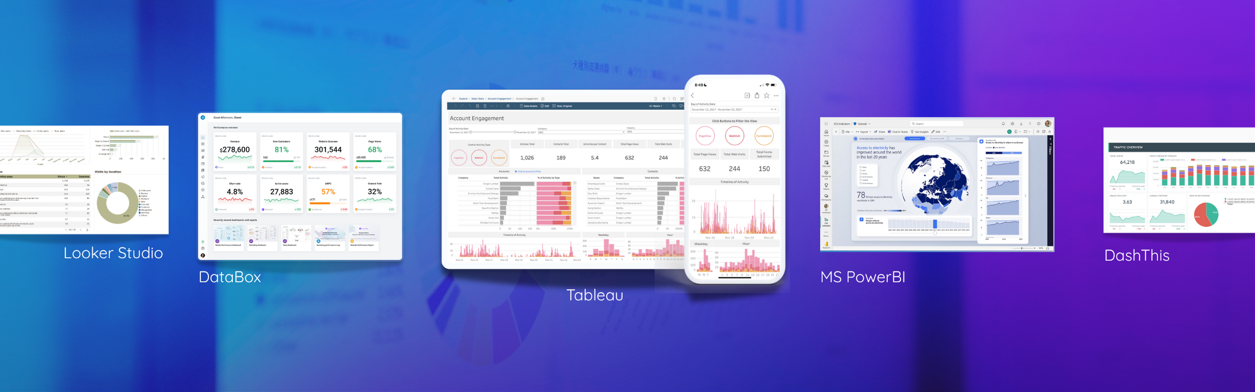
Top marketing analytics dashboard tools compared
So, you’ve nailed down your goals and set up your tracking. Now comes the fun part, actually building your dashboard. But with so many tools out there, which one should you use?
Let’s break down a few popular options we recommend to clients at Wonder Works Digital, depending on your team’s needs, budget, and tech stack.
1. Google Looker Studio (Formerly Google Data Studio)
Best for: Teams using GA4, Google Ads, and Sheets who want a free, flexible solution (note you can integrate additional data sources too).
Why it works: It's free, integrates seamlessly with the Google ecosystem, and is highly customisable. Great for hands-on teams who don’t mind a bit of setup.
Tip: There’s a huge marketplace of community templates to get a headstart.
2. Databox
Best for: Teams managing multiple campaigns and tools, with easy-to-buid and understand visuals.
Why it works: Databox offers clean visuals, real-time updates, and mobile-friendly dashboards. It’s excellent for high-level campaign and performance tracking across platforms.
Tip: It’s especially handy for exec-ready dashboards and performance snapshots.
3. DashThis
Best for: Teams who need simple, no-fuss reports for internal or client stakeholders
Why it works: DashThis does most of the work for you with drag-and-drop dashboards and scheduled reports. Less customisation, but very easy to use.
Tip: Use DashThis if your team needs quick reports with minimal setup time.
4. Microsoft Power BI
Best for: Microsoft-based organisations with access to Power Platform tools
Why it works: Power BI connects seamlessly with Excel, Microsoft products, and a wide range of databases. It supports powerful data modelling and custom reporting, ideal for internal business intelligence and combining marketing with operations or finance data.
Tip: Best used with someone on your team who’s familiar with Microsoft’s Power Platform, or willing to learn. There’s definitely a learning curve. Start small, then scale.
5. Tableau
Best for: Enterprise teams or organisations with in-house analysts and complex data needs
Why it works: Tableau offers advanced visualisation, data blending, and flexible reporting. It’s a strong choice if you want deep insights across multiple departments – from marketing to sales and beyond.
Tip: Perfect for teams with a data analyst. If you’re just after simple channel reporting, it’s probably overkill.
Compare analytics dashboard for your team
Here’s a side-by-side comparison of the top marketing dashboard tools to help you choose the best fit.
| Criteria | Looker Studio | Databox | DashThis | Power BI | Tableau |
|---|---|---|---|---|---|
| Best For | Google-centric teams | Teams with many channels | Simple client reports | Microsoft-based businesses | Enterprise teams with data analysts |
| Ease of Use | Medium | High | High | Medium | Low |
| Customisation Level | Medium | Medium | Low | High | High |
| Automation / Scheduling | Limited | Yes | Yes | Yes | Yes |
| Integration Breadth | Medium | High | Medium | High | High |
| Cost | Free | From $72/month | From $45/month | Free for desktop, Pro from $13.70/user/month | From $105/user/month |
| Ideal Team Size | Small | Small to Medium | Small | Medium to Large | Enterprise |
| Technical Knowledge Required | Medium | Low | Low | Medium to High | High |
| Best Features | Free and flexible for GA4 | Mobile-friendly, KPI tracking | Easy reporting setup | Strong data blending with Excel | Advanced visualisation across departments |
| Watchouts / Limitations | Manual setup, limited automation | Can be overkill for simple needs | Less customisation | Steeper learning curve | Not ideal for simple marketing reports |
Final thoughts on finding the right dashboard reporting tool
If you’ve ever wasted half your day jumping between tools trying to without having a clear marketing dashboard, you're not alone. That’s exactly why we wrote this post.
Because most marketers aren’t short on data, they’re short on clarity. And when your reporting is disparate, it’s hard to see what’s working, what’s not, and where to focus.
That’s where a custom digital analytics dashboard can change everything, backed up by a clear measurement strategy aligned across your business). Not as another “nice to have”, but as your daily source of focus, alignment, and confidence.
At Wonder Works Digital, we help teams build dashboards that actually make sense, for marketers, channel leads, execs, and everyone in between.
If you’ve been thinking, “we should really clean up our reporting”… this is your sign. Let’s build a custom digital dashboard that actually works for your business.