
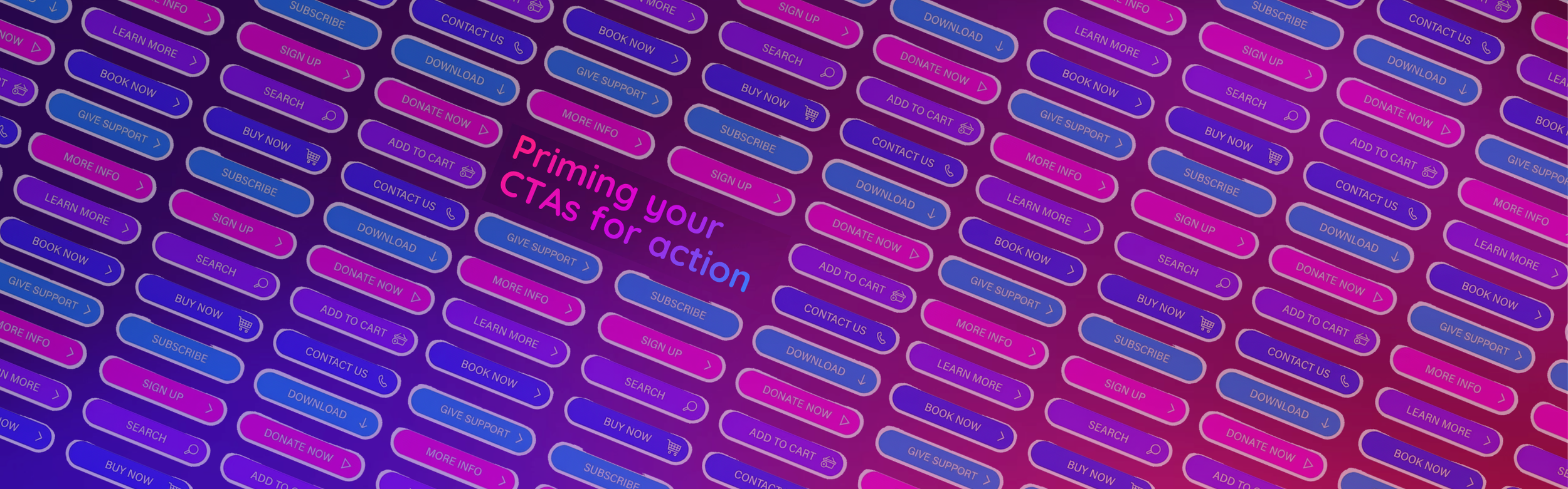
What makes a good call-to-action and why it’s harder than it seems to drive conversion
It might seem easy to set your campaign call-to-action or website button, but we’ve all seen these common mistakes: the ‘Click here’ buttons and the ‘Submit’ forms. If you have to tell someone to ‘click here’ or ‘submit’, your UX and message aren’t clear. In the rush of hitting a deadline or launching a campaign, these defaults are easy to reach for. We think we’ve checked the box: ‘The button is there, the link works, we’re good to go’.
‘Functional’ buttons have become the norm, but they don’t do justice to the great content behind them. Instead, you risk missing clicks and opportunities to drive action with your audience, and a chance to reinforce your key ask. Creating a truly effective call-to-action (CTA) isn't about being pushy, it’s about being helpful. It’s about reducing the ‘work’ your user has to do to find, and understand, what they need.
1. Choose specific actions that assist skim reading
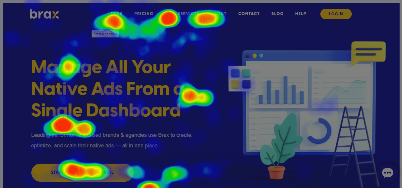
This click heat map shows a common story. People scan navigation, headings and buttons and limited copy to quickly gain clues if the page is for them, before reading on. (Source: Brax.io)
The language we use on a button is often read before users read the main text on a page. Often a user will scan a communication before reading deeply to understand what it’s about. While ‘Learn more’ is a step up from ‘Click here’, it’s often a bit of a middle ground. It’s safe, but it doesn’t tell the user what’s actually happening next.
Be active. Start with a verb that describes the action. Instead of ‘Information’, try ‘Join the project’ or ‘Start your journey’.
Be meaningful. Especially in the not-for-profit and charity space, the button is an extension of your mission. Instead of a generic ‘Donate’, consider ‘Feed a family’ or ‘Protect the forest’. Connect the action to the heart of the cause.
Keep it short. Aim for a ‘glance-able’ length. If a user can’t process the button text in a split second, the momentum is lost.
Take a breath. Writing short copy is surprisingly difficult! Distilling a complex idea into three words takes practise, so don’t be discouraged if it doesn’t come naturally at first.
2. Design for an easy-to-understand experience
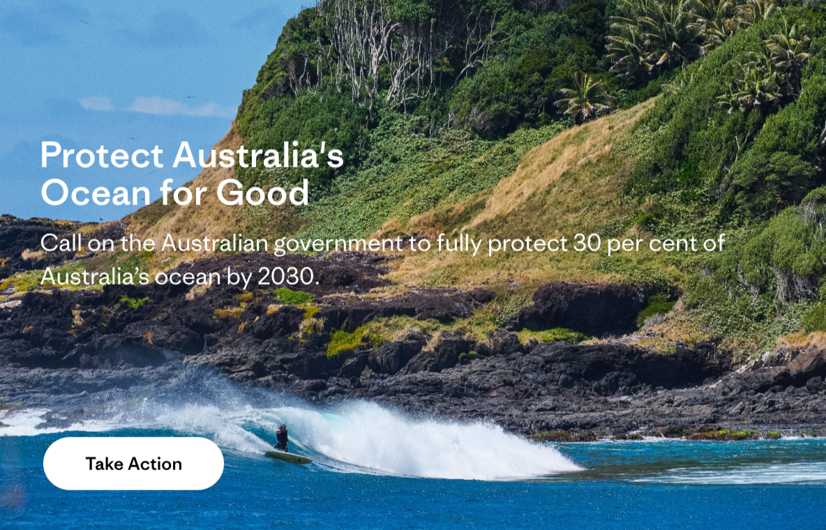
Patagonia’s ask for support is clear with ‘Take Action’
The biggest blocker to your audience not taking action is time it takes for them to understand the ask. This is where the neuroscience of cognitive load comes in. When a user lands on a page or opens an email, they are subconsciously scanning for clues on what to do. If every button is a different size, colour or shape, their brain has to ‘re-learn’ every time they go to a new page, look at a new email or receive a direct mail piece – meaning you’re adding to their load to understand a page before they even read the content.
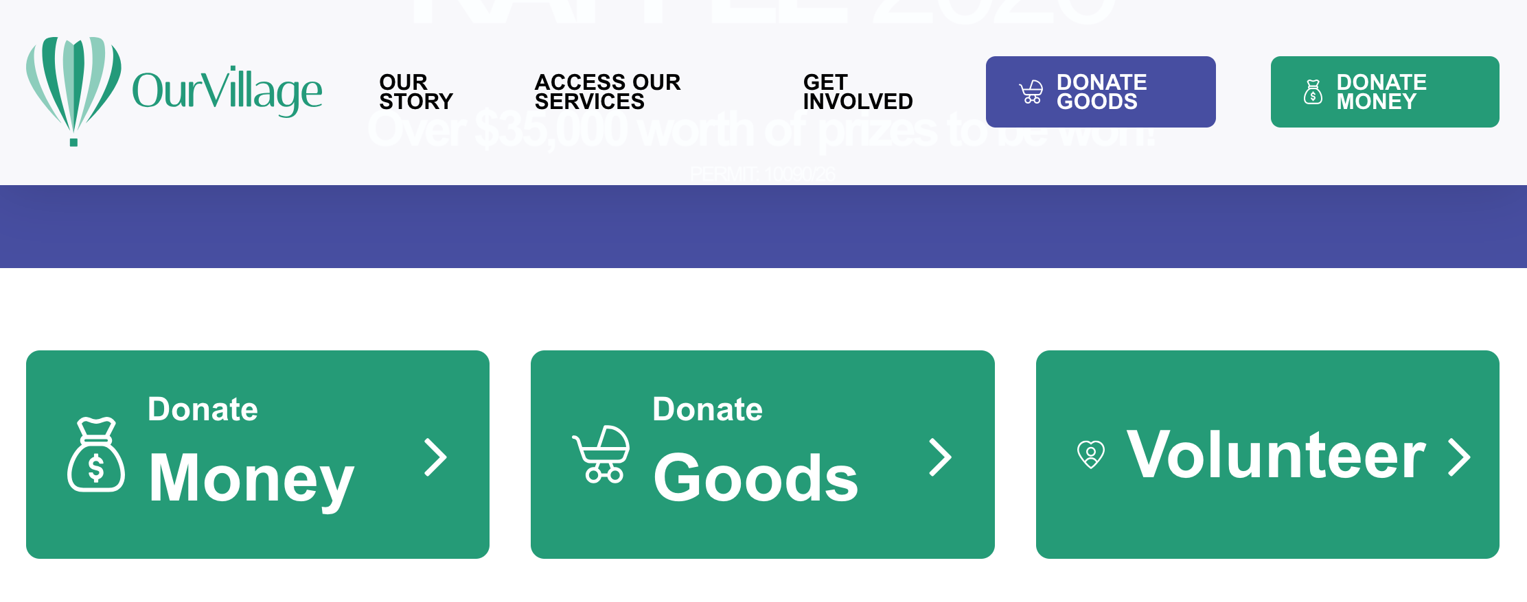
Our Village have clear CTA messages and consistent colours. https://ourvillage.org.au/
Consistency is key. Style your buttons the same way. When they have a consistent width, shape and colour, you create a visual anchor that feels professional and stable.
Choose a standout colour for your primary CTA. This is your main ask in a campaign, page or appeal. Give it your boldest, most vibrant brand colour, which contrasts well with the rest of your design. This becomes your action colour; when a user sees it, they visually understand the core action, and don’t have to search for it.
If you need more than one CTA, set a consistent secondary colour. For other helpful links that aren’t the main goal, use a consistent secondary colour that still stands out, but doesn’t compete with your primary CTA style. Don’t go beyond two button colour styles – this will confuse users, adding to their cognitive load to scan a communication.
3. Be clear what you’re asking with one main CTA
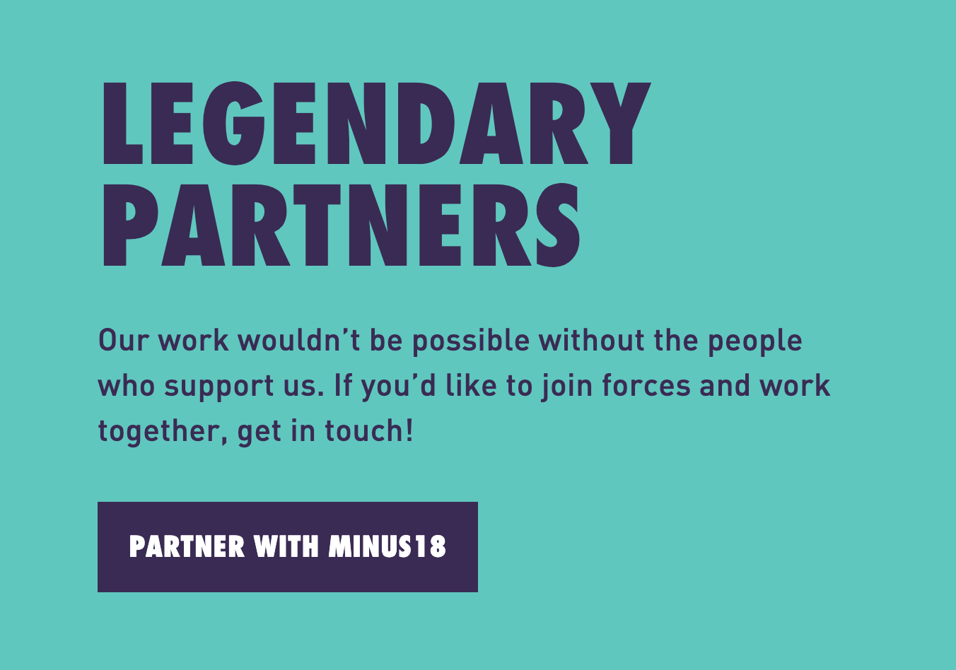
You can scan this Minus 18 ask by reading the heading, then the button text, to know exactly what to do.
Having consistent button styles isn’t an allowance to have a lot of CTAs. Direct marketing principles tell us to have just one CTA on a page, email or letter, priming our users for conversion. In a perfect world, every page would have just one button.
In the real world of newsletters and websites, that’s not always possible. But it is important to limit your CTAs. Consider the ‘Too many jams’ study (Iyengar & Lepper 2000), which shows the ‘paradox of choice’. In the study, people were presented with either a wall of 6 jams to choose and buy from, or a wall of 24 jams. When there was less choice, 30% more sales were generated.
The same applies in our campaigns. Boil your communication down to the one main thing you want people to do. Then, if you have to, think about our users who aren’t ready, and what else you can help them do. It’s ok to add more than one CTA, but try to limit them to a maximum of 3 or 4.
4. Small steps, for big change
Next time you’re about to hit publish on a ‘Learn more’ button, take one extra minute. Ask yourself: ‘Does this tell my user what I want them to do?’
These small tweaks to your CTAs make your mission clearer and your content better primed for conversion.
Sources and references
Bitly blog: Landing page CTA button best practices that convert
Campaign Monitor: 15 effective ways nonprofits can drive donations online
Iyengar SS and Lepper MR (2000) ‘When choice is demotivating: can one desire too much of a good thing?’, Journal of Personality and Social Psychology, 6(79):996–1006.
The Decision Lab: The paradox of choice